数据说明
- 数据来源:Kaggle
- 可视化代码来源:EDA l Data Visualization
- 使用Kaggle在线Jupyter Notebook实现
载入数据
1 | # This Python 3 environment comes with many helpful analytics libraries installed |
['insurance']
1 | import numpy as np |
1 | df = pd.read_csv("../input/insurance/insurance.csv") ## 加载数据 |
| age | sex | bmi | children | smoker | region | charges | |
|---|---|---|---|---|---|---|---|
| 0 | 19 | female | 27.900 | 0 | yes | southwest | 16884.92400 |
| 1 | 18 | male | 33.770 | 1 | no | southeast | 1725.55230 |
| 2 | 28 | male | 33.000 | 3 | no | southeast | 4449.46200 |
| 3 | 33 | male | 22.705 | 0 | no | northwest | 21984.47061 |
| 4 | 32 | male | 28.880 | 0 | no | northwest | 3866.85520 |
1 | print(df.shape) ## 查看数据的维度 |
(1338, 7)
               age          bmi     children       charges
count  1338.000000  1338.000000  1338.000000   1338.000000
mean     39.207025    30.663397     1.094918  13270.422265
std      14.049960     6.098187     1.205493  12110.011237
min      18.000000    15.960000     0.000000   1121.873900
25%      27.000000    26.296250     0.000000   4740.287150
50%      39.000000    30.400000     1.000000   9382.033000
75%      51.000000    34.693750     2.000000  16639.912515
max      64.000000    53.130000     5.000000  63770.428010
Total number of NULL value in the dataset: age         0
sex         0
bmi         0
children    0
smoker      0
region      0
charges     0
dtype: int64
新建特征
BMI:
- Normal: bmi <= 24
- OverWeight: 24 < bmi <30
- Obese: bmi >= 30
1 | ## 按照bmi划分 |
| age | sex | bmi | children | smoker | region | charges | risk_type | Age_group | |
|---|---|---|---|---|---|---|---|---|---|
| 0 | 19 | female | 27.900 | 0 | yes | southwest | 16884.92400 | OverWeight | Age below 25 year |
| 1 | 18 | male | 33.770 | 1 | no | southeast | 1725.55230 | Obese | Age below 25 year |
| 2 | 28 | male | 33.000 | 3 | no | southeast | 4449.46200 | Obese | Age 25 to 34 year |
| 3 | 33 | male | 22.705 | 0 | no | northwest | 21984.47061 | Normal | Age 25 to 34 year |
| 4 | 32 | male | 28.880 | 0 | no | northwest | 3866.85520 | OverWeight | Age 25 to 34 year |
也可应用Pandas模块中的cut()函数进行分组,具体可见Post not found: python-pandas模块 Pandas模块。
1 | ## 分组也可按如下操作 |
1 | df["Charge"] = df["charges"]/1000 |
数据可视化
1 | ## 相关图 |
<seaborn.axisgrid.PairGrid at 0x7f6074b5ced0>

- 对角线上的是特征的样本数据直方图
- 非对角线的是两两特征之间的相关图(以两特征分别为横纵轴)
charges是Charge除以1000得到的,二者完全正相关,因此相关图呈一条45度的直线bmi与age没有什么相关性- 不同
charges区间中,charges以及Charge与age呈正相关
1 | plt.rcParams["figure.figsize"] = (20, 14) |
Text(0.5, 1.0, 'Age_group distribution in the Data')
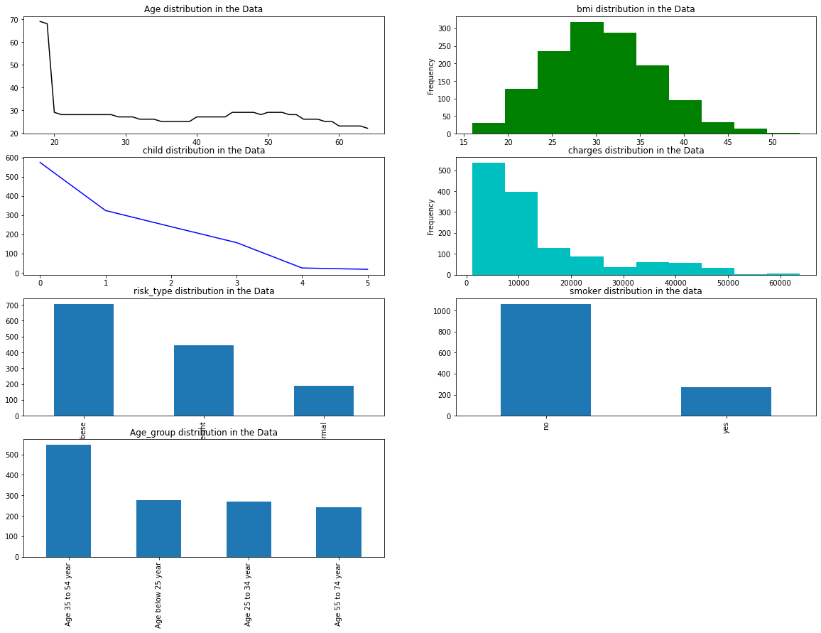
- 样本中的年龄主要集中分布在“小于20岁”区间
- 样本中肥胖的样本较多
- 样本中,抽烟的样本较少,不抽样的样本较多
1 | plt.rcParams['figure.figsize'] = (18, 8) |
<matplotlib.axes._subplots.AxesSubplot at 0x7f6069f93d90>
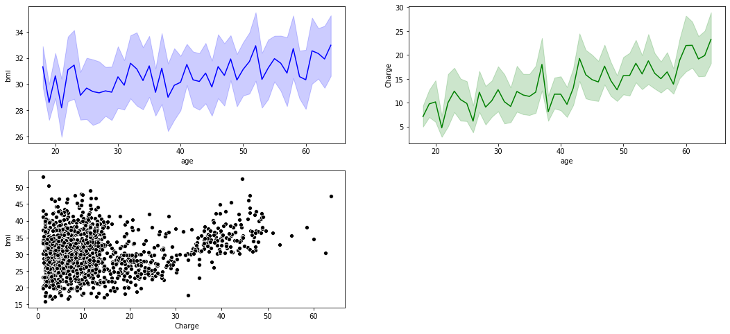
bmi有随age上升而上升的趋势charges有随age上升而上升的趋势
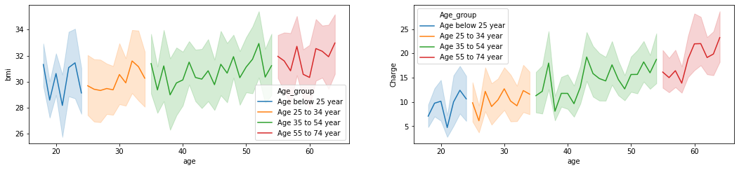
下面按年龄段绘制bmi、charges与age的折线图:
1 | plt.rcParams['figure.figsize'] = (18, 8) |
<matplotlib.axes._subplots.AxesSubplot at 0x7f6069d0fad0>
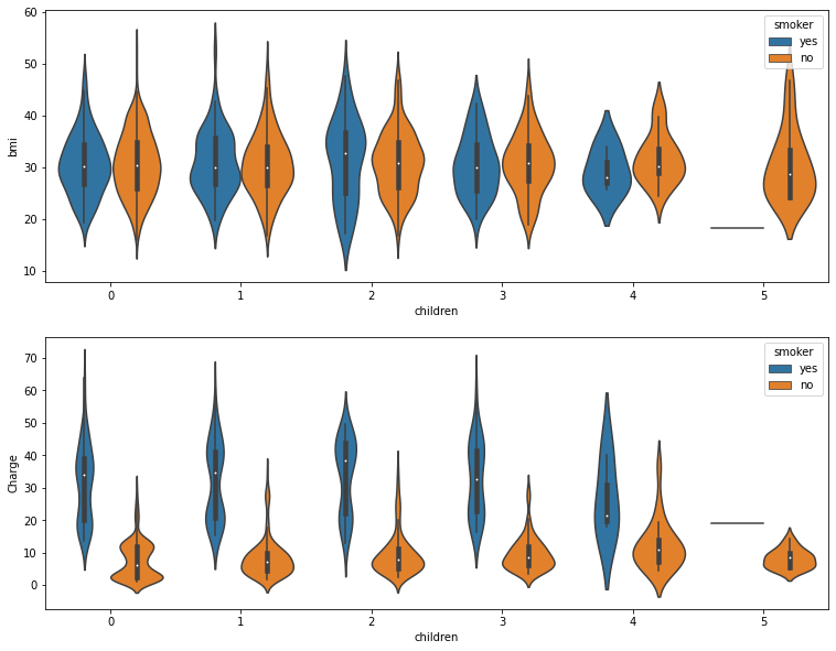
1 | plt.rcParams["figure.figsize"]=(18,8) |
<matplotlib.axes._subplots.AxesSubplot at 0x7f6069c22150>
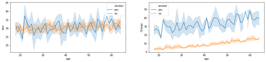
- 不吸烟的人的
Charge整体比吸烟的人低
1 | ## region |
Text(0.5, 1.0, 'northeast region')
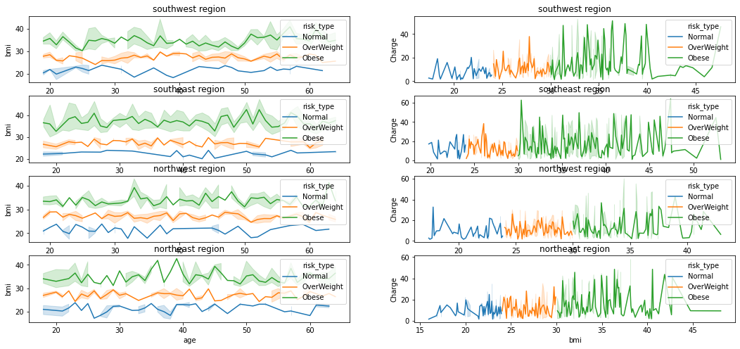
1 | plt.rcParams["figure.figsize"]=(16,6) |
<matplotlib.axes._subplots.AxesSubplot at 0x7f60692f6590>
1 | plt.rcParams["figure.figsize"]=(16,6) |
<matplotlib.axes._subplots.AxesSubplot at 0x7f6069128bd0>
1 | plt.rcParams["figure.figsize"]=(28,10) |
<matplotlib.axes._subplots.AxesSubplot at 0x7f6069054ad0>